


Representing Multiple Attributes in a Map
- Make Custom symbols in Quantum GIS
- Export symbols for saving styles
- Represent the owners with more than 20,000 acres of land in each county
- Zip code level traffic crash statistics aggregated with type of crash 3. Represent districts where the vote share for a part has crossed a
- you can add others to this list.
We can take a hypothetical situation in Alabama. We need to know the major landowners in each county. This information is important to make roundwood procurement decisions.
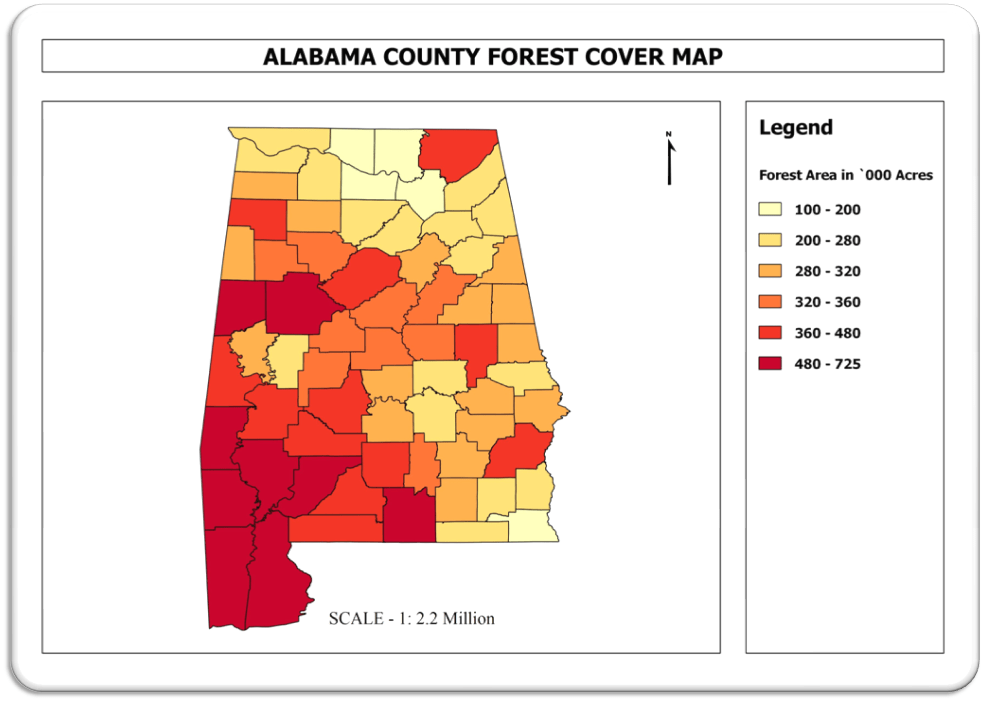
Figure 1:: Map of Alabama Counties with Total forestland in each county.
We also have the acres owned by multiple entities in each county from tax roll. In many cases the name in the deed is different from the main company name. This ownership data has to be preprocessed to standardise the names. One way to get this in a systematic way is to reduce the company name into acronyms. This will help in managing the data and merging the records.
Our final output will look like the screenshot below
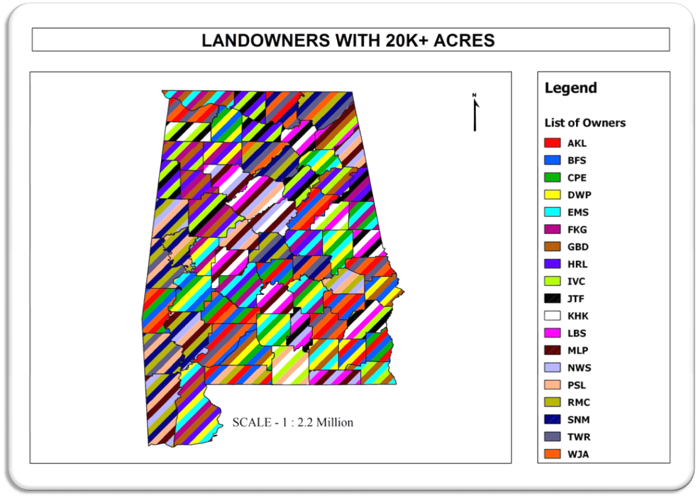
Figure 2: Large forestland owners in each county*
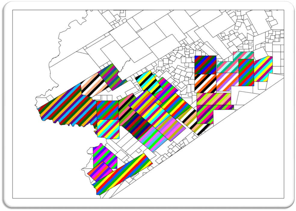
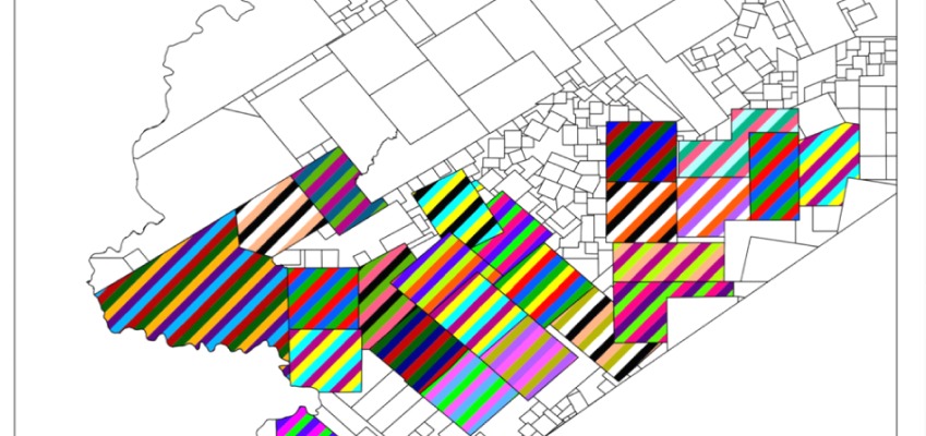
Figure 3: Lease ownership within abstracts in Texas*
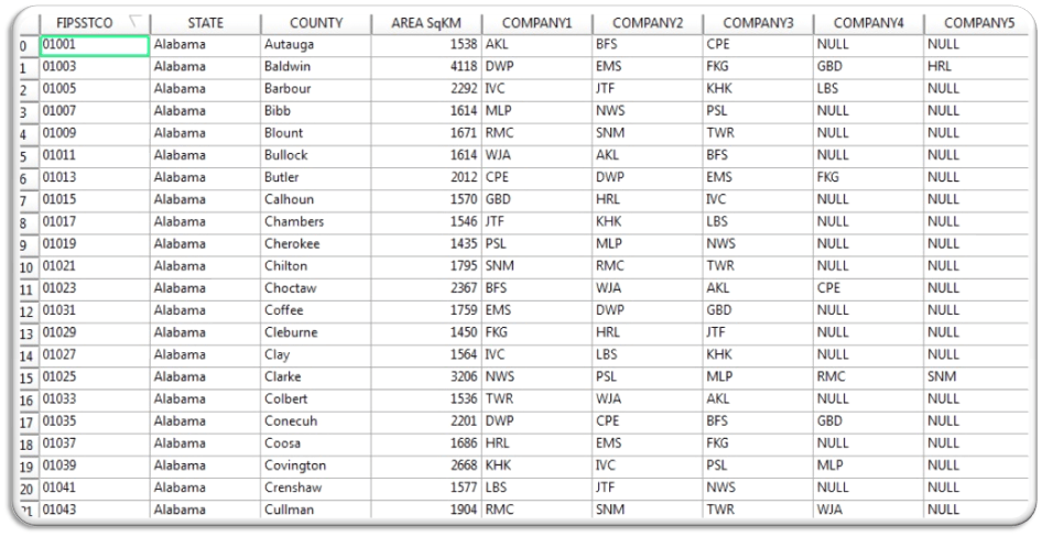
Figure 4: Excel Screenshot of standardized owner names ( 3 letter acronyms )
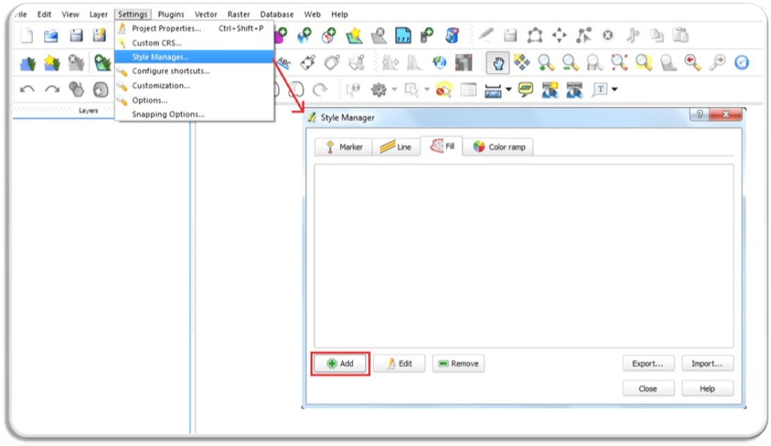
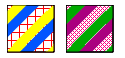
We used stripes with colors to display multiple ownership of each county. This was done using Quantum GIS, were the styles for different number of owners was created beforehand to use it in these maps.
Steps involved in creating the Custom Styles
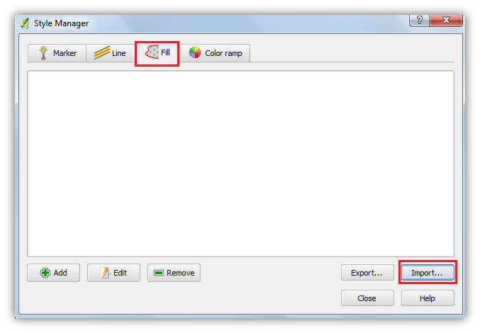
1.Open Quantum GIS workspace and in the menu bar select ‘settings’ –> ‘style manager’ –> choose ‘fill’ tab.
2.Click ‘add’ button which opens ‘symbol properties’ –> click ‘+’ button to add the number of strips to requirement. ‘Simple fill’ option would be the default.
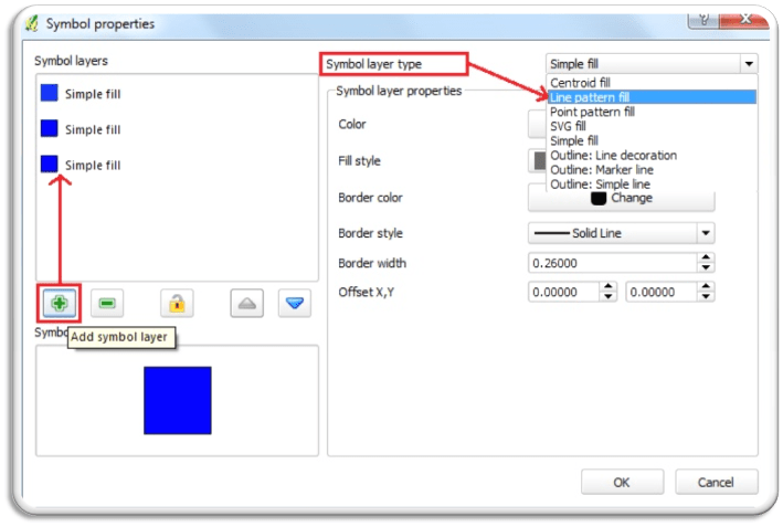
3.Select the ‘symbol layers’ and change the ‘symbol layer type’ to ‘line pattern fill’ for all the added.
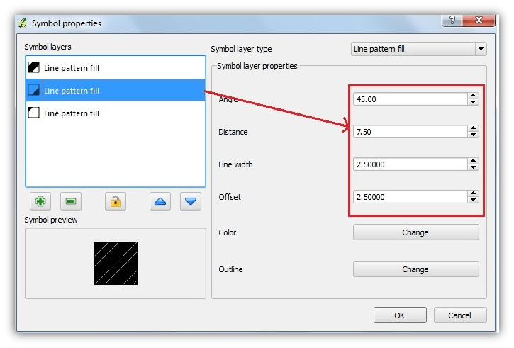
4.Select every single layer and in ‘symbol layer properties’ set the ‘angle’ at 45 degree and ‘line width’ to 2.50 which makes the strips visible as well as provides space for the subsequent layers.
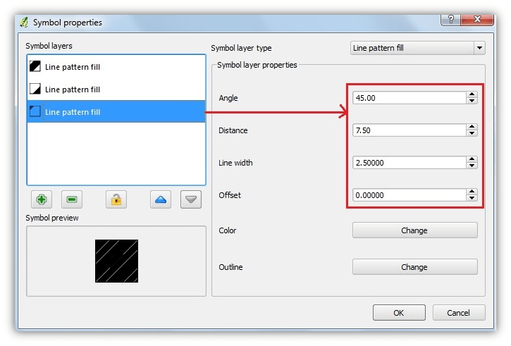
5. The ‘distance’ depends upon the number of layers present, it is 7.50 ( 2.5 times 3) for 3 layers (3 owners), 10.00 for 4 layers and 12.50 for 5 layers which is all based on the ‘line width’, since it is set at 2.50 the ‘distance’ are all in the multiples.
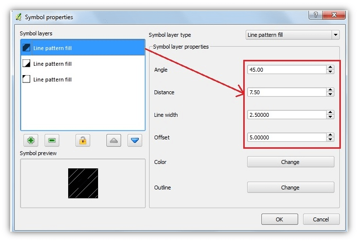
6. The ‘offset’ varies for each individual layer, as multiples of 2.50. This is done to avoid the strips from overlapping. The first layer has an offset value of 0.00.
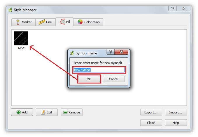
7. Click ‘ok’ after finishing the style and save it with a new name for the style and click ‘ok’.
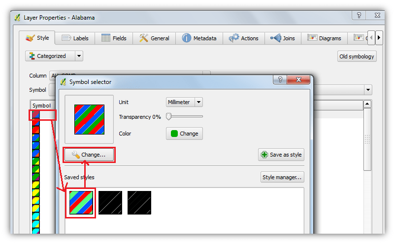
8. For each polygon a specific style can be chosen for each class by opening ‘layer properties’ → ‘symbol selector’ and selecting the anyone of the saved styles, while the colours of the strips can be edited by clicking the change button.
9. The styles which were created can also be sent to other users by exporting the created styles into a .xml file.
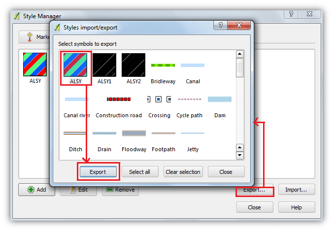
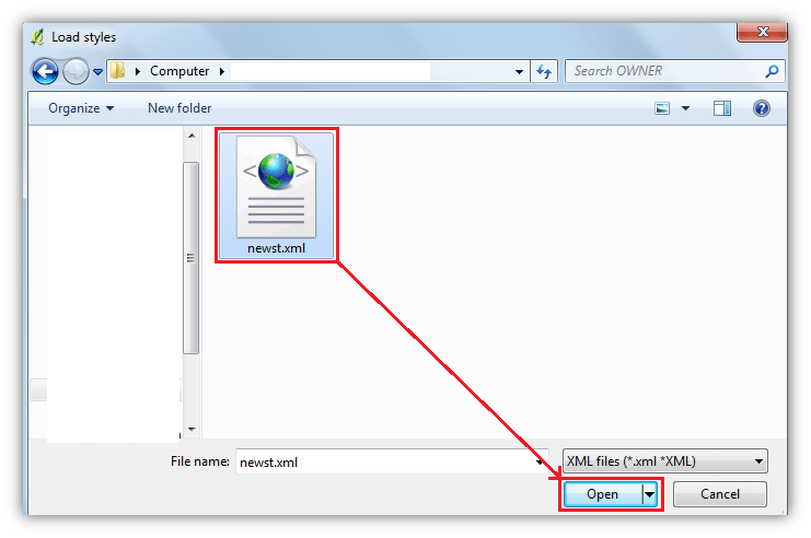
10. These .xml files can be imported as respective styles into the ‘style manager’ of other systems.
11.These styles with strips of solid fills can be replaced with other patterns. These are a few examples of the above.
* All the ownership names used are fictitious.